openclaw-not-endpoint-20260314-143500
10 张图片 baoyuOutline
---
strategy: b-dense
name: Information-Dense Full Version (信息密集全文版)
style: notion
style_reason: "Notion 极简线条风格适合认知型干货,突出知识质感和专业深度"
elements:
background: solid-white
decorations: [hand-drawn-lines, arrows-curvy]
emphasis: circle-mark
typography: handwritten
layout: dense
image_count: 8
---
## Image 1 of 8
**Position**: Cover
**Layout**: sparse
**Hook**: 别急着学 OpenClaw,先搞清楚你在学什么
**Slug**: cover
**Filename**: 01-cover.png
**Text Content**:
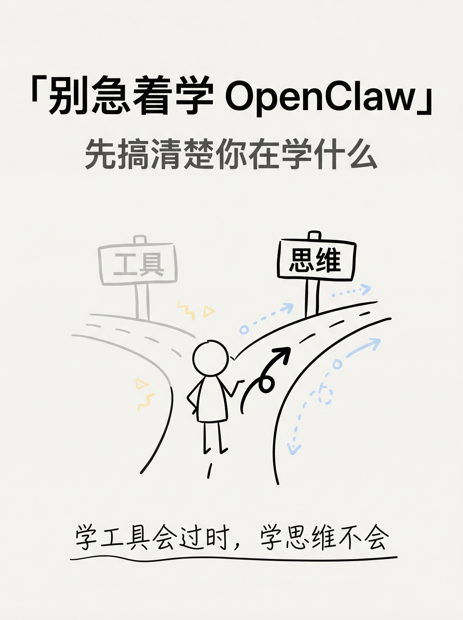
- Title: 「别急着学 OpenClaw」
- Subtitle: 先搞清楚你在学什么
- Tags: #AI认知升级 #Agent思维
- Bottom hook: 学工具会过时,学思维不会
**Visual Concept**:
白色干净背景,极简手绘风格
中央一个简笔画小人站在分叉路口
左边路牌写"工具"(灰色),右边路牌写"思维"(黑色加粗)
小人面朝右边路,手绘箭头指向"思维"方向
底部一行手写体标语
整体 Notion 笔记风格:黑线白底,偶尔一两个淡蓝/淡黄色块点缀
---
## Image 2 of 8
**Position**: Content
**Layout**: comparison
**Core Message**: "使用"AI vs "驾驭"AI — 两种完全不同的关系
**Slug**: use-vs-master
**Filename**: 02-content-use-vs-master.png
**Text Content**:
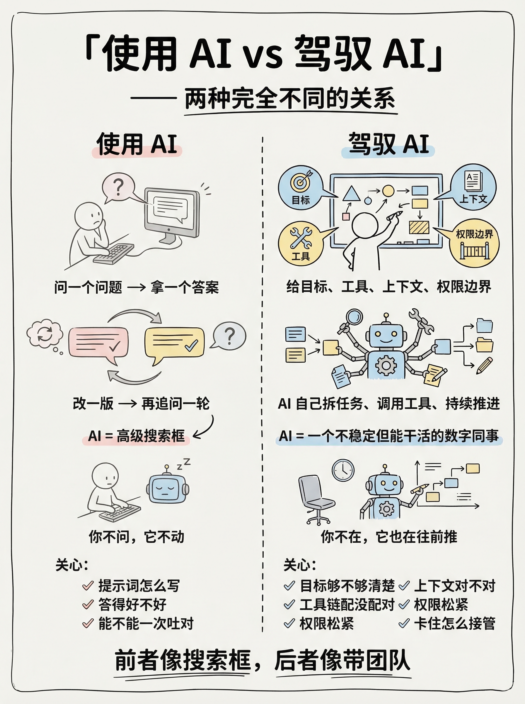
- Title: 「使用 AI vs 驾驭 AI」
- Left column (使用 AI):
- 问一个问题 → 拿一个答案
- 改一版 → 再追问一轮
- AI = 高级搜索框
- 你不问,它不动
- 关心:提示词怎么写、答得好不好、能不能一次吐对
- Right column (驾驭 AI):
- 给目标、工具、上下文、权限边界
- AI 自己拆任务、调用工具、持续推进
- AI = 一个不稳定但能干活的数字同事
- 你不在,它也在往前推
- 关心:目标够不够清楚、上下文对不对、工具链配没配对、权限松紧、卡住怎么接管
- Bottom: 前者像搜索框,后者像带团队
**Visual Concept**:
左右对比分割,Notion 极简线条风
左侧用灰色线条和淡色调——一个小人对着屏幕打字,循环箭头
右侧用黑色线条和淡蓝色块——一个小人在白板前部署,旁边 AI 机器人自主工作
中间手绘虚线分割
底部一句总结,手写字体加下划线
---
## Image 3 of 8
**Position**: Content
**Layout**: dense
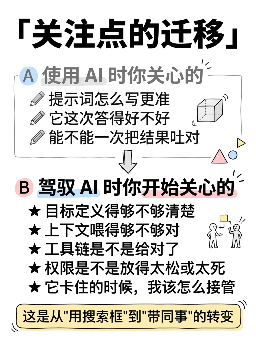
**Core Message**: 从"使用"到"驾驭",你的关注点完全变了
**Slug**: focus-shift
**Filename**: 03-content-focus-shift.png
**Text Content**:
- Title: 「关注点的迁移」
- Section A — 使用 AI 时你关心的:
- ✎ 提示词怎么写更准
- ✎ 它这次答得好不好
- ✎ 能不能一次把结果吐对
- Section B — 驾驭 AI 时你开始关心的:
- ★ 目标定义得够不够清楚
- ★ 上下文喂得够不够对
- ★ 工具链是不是给对了
- ★ 权限是不是放得太松或太死
- ★ 它卡住的时候,我该怎么接管
- Bottom highlight box: 这是从"用搜索框"到"带同事"的转变
**Visual Concept**:
上下两个区块,Section A 用灰色文字和铅笔图标,Section B 用黑色加粗和星号图标
Section B 行数明显多于 A,视觉强调"驾驭需要关注更多维度"
每个要点前有手绘小图标
底部圆角方框里放金句,用淡黄色高亮
Notion 白底黑线风格
---
## Image 4 of 8
**Position**: Content
**Layout**: flow
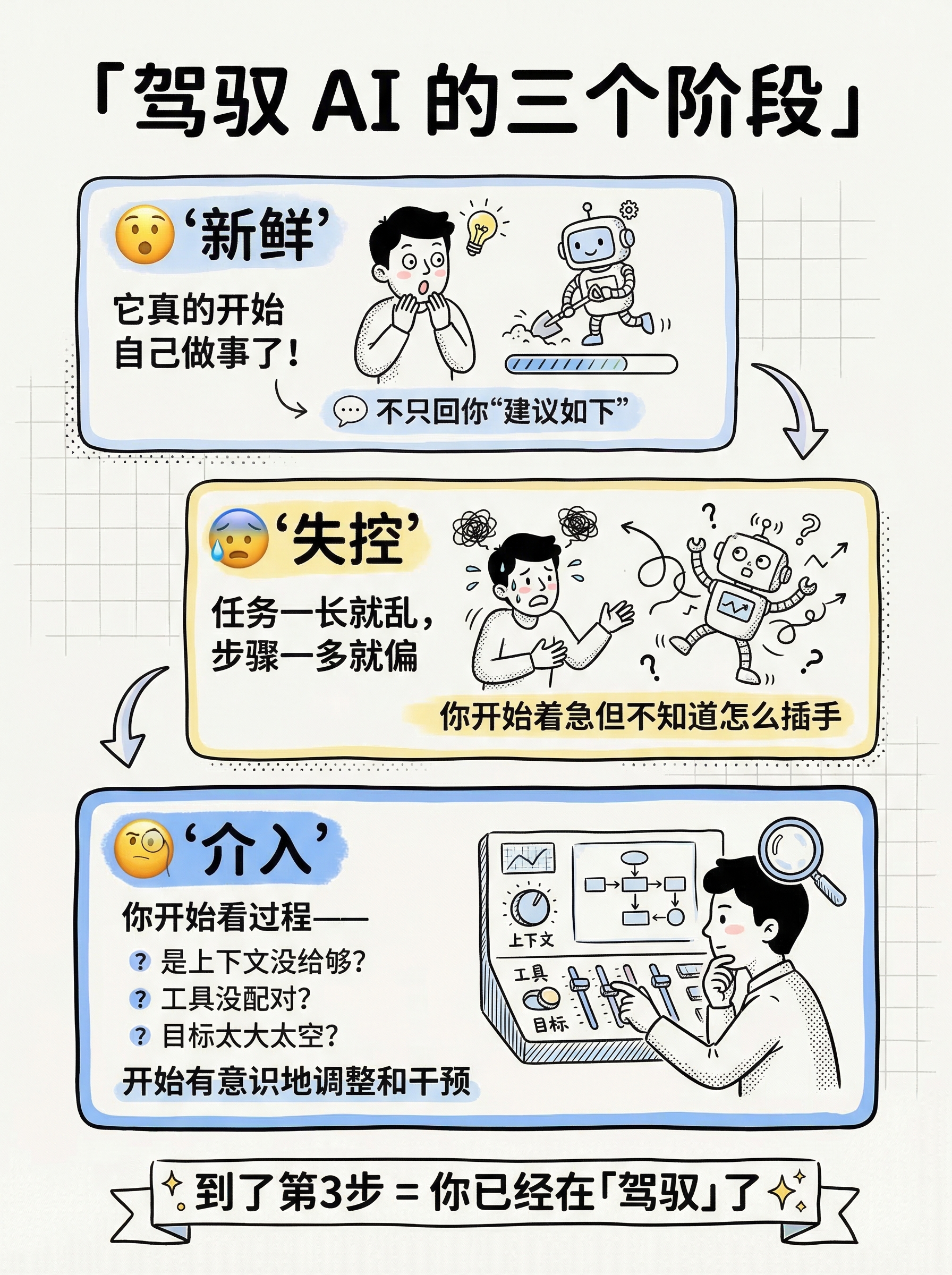
**Core Message**: 上手 Agent 的三个阶段
**Slug**: three-stages
**Filename**: 04-content-three-stages.png
**Text Content**:
- Title: 「驾驭 AI 的三个阶段」
- Stage 1: 😮 新鲜
- "它真的开始自己做事了!"
- 不只回你"建议如下"
- Stage 2: 😰 失控
- 任务一长就乱,步骤一多就偏
- 你开始着急但不知道怎么插手
- Stage 3: 🧐 介入
- 你开始看过程——
- 是上下文没给够?工具没配对?目标太大太空?
- 开始有意识地调整和干预
- Bottom: 到了第3步 = 你已经在「驾驭」了 ✨
**Visual Concept**:
三步流程图,从上到下或从左到右
每一步是一个手绘方框,里面有简笔小人的三种状态
方框之间用手绘弯曲箭头连接
第三步的方框稍大、边框加粗,表示"这才是重点"
整体 Notion 线条风,黑白为主,第三步加淡蓝色背景高亮
---
## Image 5 of 8
**Position**: Content
**Layout**: list
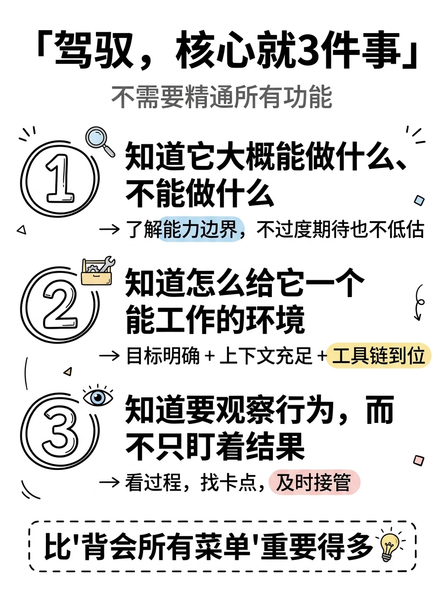
**Core Message**: 驾驭,核心就三件事
**Slug**: three-keys
**Filename**: 05-content-three-keys.png
**Text Content**:
- Title: 「驾驭,核心就3件事」
- Subtitle: 不需要精通所有功能
- 1️⃣ 知道它大概能做什么、不能做什么
- → 了解能力边界,不过度期待也不低估
- 2️⃣ 知道怎么给它一个能工作的环境
- → 目标明确 + 上下文充足 + 工具链到位
- 3️⃣ 知道要观察行为,而不只盯着结果
- → 看过程,找卡点,及时接管
- Bottom emphasis: 比"背会所有菜单"重要得多 💡
**Visual Concept**:
竖向清单风格,三个大号手绘数字
每个数字配一个核心句 + 一行展开说明
关键词用手绘圆圈或下划线标注
底部用虚线框放总结语
Notion 风格:干净白底,黑色线条,淡色点缀,数字特别突出
---
## Image 6 of 8
**Position**: Content
**Layout**: list
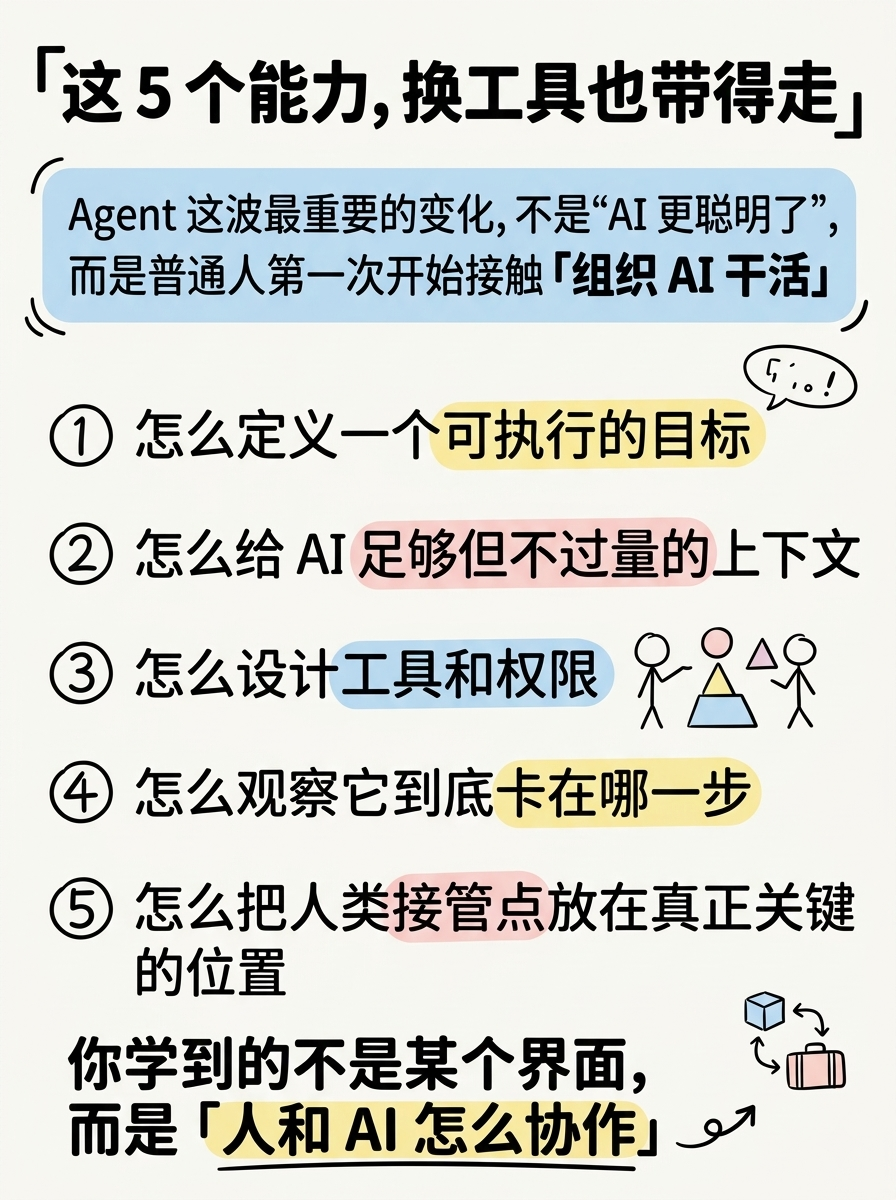
**Core Message**: 不会过时的判断框架
**Slug**: framework
**Filename**: 06-content-framework.png
**Text Content**:
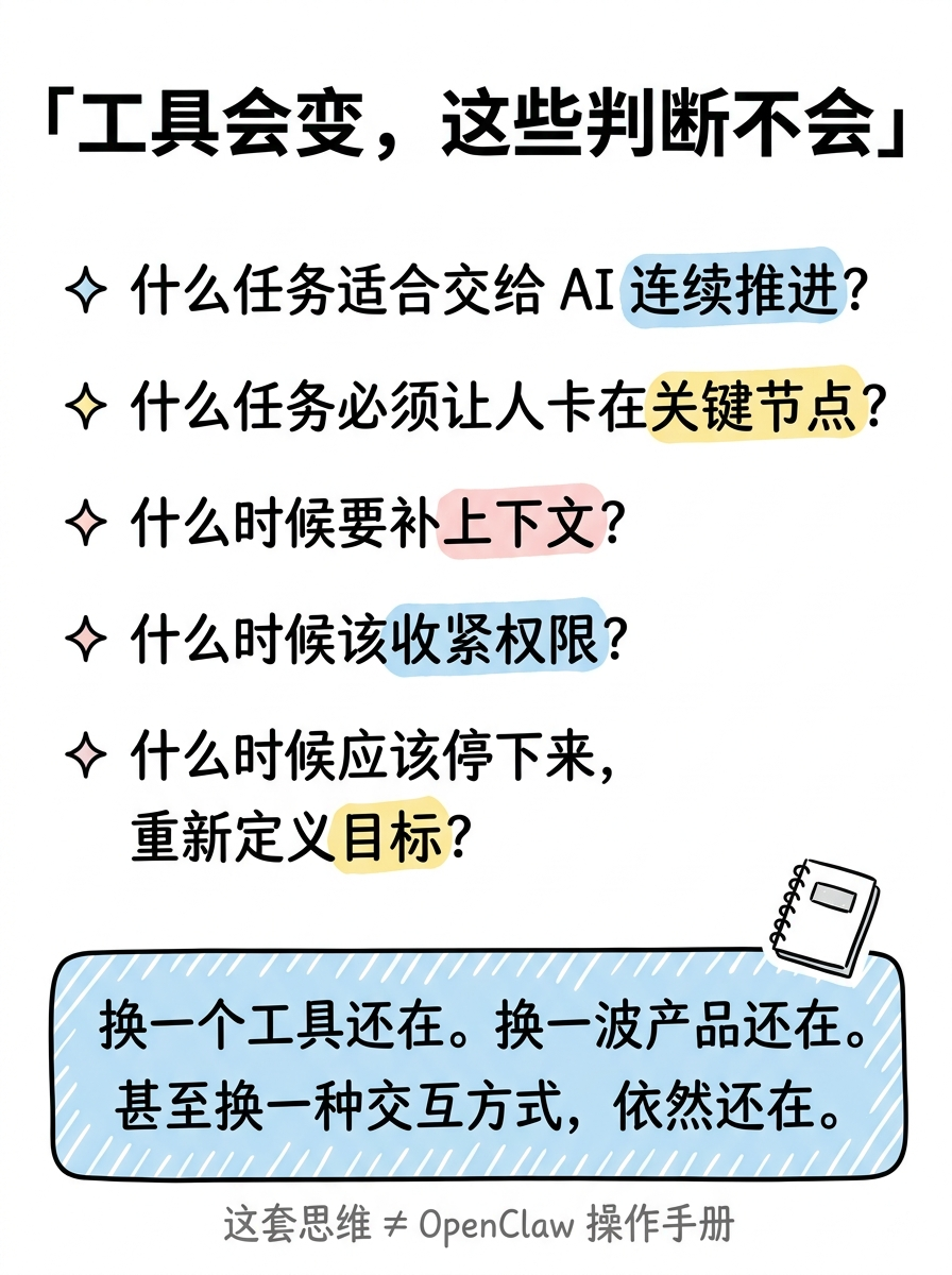
- Title: 「工具会变,这些判断不会」
- Framework:
- ✦ 什么任务适合交给 AI 连续推进?
- ✦ 什么任务必须让人卡在关键节点?
- ✦ 什么时候要补上下文?
- ✦ 什么时候该收紧权限?
- ✦ 什么时候应该停下来,重新定义目标?
- Bottom box: 换一个工具还在。换一波产品还在。甚至换一种交互方式,依然还在。
- Tag: 这套思维 ≠ OpenClaw 操作手册
**Visual Concept**:
备忘录/清单卡片风格
每条用手绘菱形标记
关键词(连续推进、关键节点、上下文、权限、目标)用手绘高亮笔效果
底部圆角框里放总结金句,用淡蓝色背景
右下角小手绘:一本打开的笔记本
Notion 极简风:像一页值得收藏的笔记
---
## Image 7 of 8
**Position**: Content
**Layout**: dense
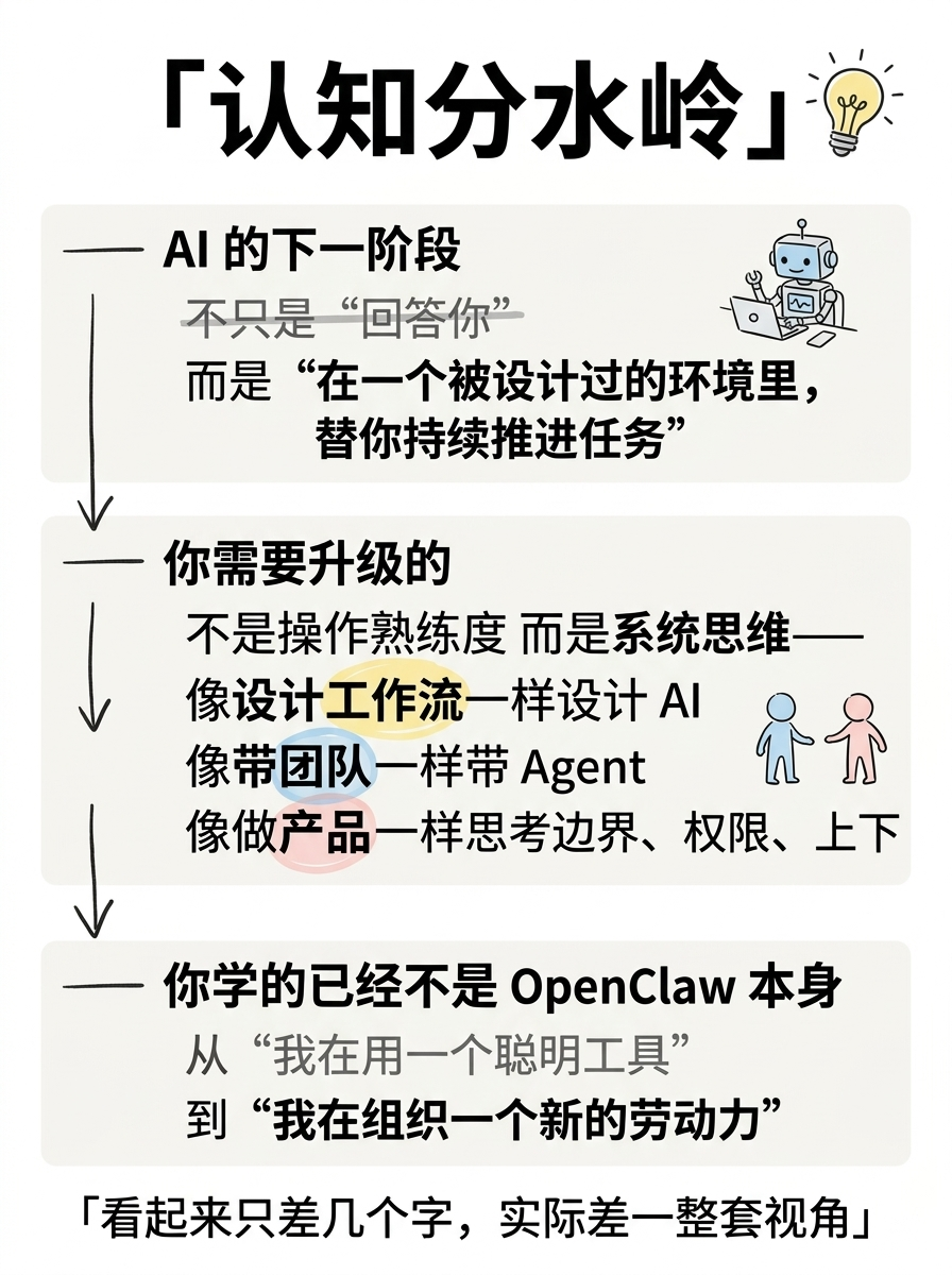
**Core Message**: 认知分水岭 — 你学的到底是什么?
**Slug**: watershed
**Filename**: 07-content-watershed.png
**Text Content**:
- Title: 「认知分水岭」
- Section 1 — AI 的下一阶段:
- 不只是"回答你"
- 而是"在一个被设计过的环境里,替你持续推进任务"
- Section 2 — 你需要升级的不是操作熟练度,而是系统思维:
- 像设计工作流一样设计 AI
- 像带团队一样带 Agent
- 像做产品一样思考边界、权限、上下文和容错
- Section 3 — 你学的已经不是 OpenClaw 本身:
- 怎么从"我在用一个聪明工具"
- 走到"我在组织一个新的劳动力"
- Bottom: 看起来只差几个字,实际差一整套视角
**Visual Concept**:
三个区块垂直排列,每个区块有标题线
区块之间用手绘下箭头连接,暗示"层层递进"
关键句加粗或手绘下划线
底部金句用手绘引号包围
整体像一页认知笔记,Notion 极简风格
可以有一个小的手绘灯泡图标在标题旁
---
## Image 8 of 8
**Position**: Ending
**Layout**: balanced
**Core Message**: 别急着学 OpenClaw,先搞清楚你在学什么
**Slug**: ending
**Filename**: 08-ending.png
**Text Content**:
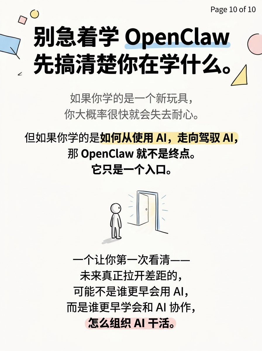
- Title: 「所以,别急着学 OpenClaw」
- Core message:
- 如果你学的是一个新玩具 → 你大概率很快就会失去耐心
- 如果你学的是如何从使用 AI 走向驾驭 AI → 它只是一个入口
- Three action items:
- 1️⃣ 给它一个真实的小任务,不要只聊天
- 2️⃣ 观察它卡在哪,而不只看它答得漂不漂亮
- 3️⃣ 试完以后,再决定你要不要继续
- Final quote: 「未来拉开差距的,可能不是谁更早会用 AI,而是谁更早学会怎么和 AI 协作、怎么组织 AI 干活。」
- End question: 你学 OpenClaw,学的是一个工具,还是一套思维方式?
**Visual Concept**:
干净收尾页
顶部标题大而醒目
中间两行对比(新玩具 vs 入口)用手绘箭头区分
三条行动建议用编号列表
底部引号框放最后金句
最后一行用手写体问句收尾
Notion 风格:白底黑字,简约但信息完整
整体给人"这页值得截图收藏"的感觉
#1
cover
01-cover.png
Create a Xiaohongshu (Little Red Book) style infographic following these guidelines:
## Image Specifications
- **Type**: Infographic
- **Orientation**: Portrait (vertical)
- **Aspect Ratio**: 3:4
- **Style**: Hand-drawn illustration
## Core Principles
- Hand-drawn quality throughout - NO realistic or photographic elements
- Keep information concise, highlight keywords and core concepts
- Use ample whitespace for easy visual scanning
- Maintain clear visual hierarchy
## Text Style (CRITICAL)
- **ALL text MUST be hand-drawn style**
- Main titles should be prominent and eye-catching
- Key text should be bold and enlarged
- Use highlighter effects to emphasize keywords
- **DO NOT use realistic or computer-generated fonts**
## Language
- All text in Chinese (简体中文)
- Match punctuation style: "",。!
---
## Style: Notion
**Color Palette**:
- Primary: Black (#1A1A1A), dark gray (#4A4A4A)
- Background: Pure white (#FFFFFF), off-white (#FAFAFA)
- Accents: Pastel blue (#A8D4F0), pastel yellow (#F9E79F), pastel pink (#FADBD8)
**Visual Elements**:
- Simple line doodles, hand-drawn wobble effect
- Geometric shapes, stick figures
- Maximum whitespace, single-weight ink lines
- Clean, uncluttered compositions
**Typography**:
- Clean hand-drawn lettering
- Simple sans-serif labels
- Minimal decoration on text
---
## Layout: Sparse
**Information Density**: Low (1-2 key points)
**Whitespace**: 60-70% of canvas
**Structure**:
- Single focal point centered
- Breathing room on all sides
- Maximum visual impact
---
## Content
**Position**: Cover (Page 1 of 8)
**Core Message**: 别急着学 OpenClaw,先搞清楚你在学什么
**Text Content**:
- Title: 「别急着学 OpenClaw」(centered, large, bold black hand-drawn lettering)
- Subtitle: 先搞清楚你在学什么 (slightly smaller, dark gray)
- Bottom hook text: 学工具会过时,学思维不会 (hand-written style, with hand-drawn underline)
- NO tags, NO hashtags — keep the cover clean
**Visual Concept**:
Clean white background, minimalist Notion-style line art.
Center: A simple stick figure standing at a fork in the road.
Left road sign (gray, lighter): "工具" (Tools)
Right road sign (black, bold): "思维" (Thinking)
The stick figure faces the right path, with a hand-drawn curvy arrow pointing that direction.
Bottom: The hook text in handwritten style with a gentle underline.
Decorations: A few hand-drawn arrows and small geometric shapes scattered lightly.
Overall feel: Clean, intellectual, like a page from a well-designed notebook.
---
Please use nano banana pro to generate the infographic based on the specifications above.
#2
content pain point
02-content-pain-point.png
Create a Xiaohongshu (Little Red Book) style infographic following these guidelines:
## Image Specifications
- **Type**: Infographic
- **Orientation**: Portrait (vertical)
- **Aspect Ratio**: 3:4
- **Style**: Hand-drawn illustration
## Core Principles
- Hand-drawn quality throughout - NO realistic or photographic elements
- Information dense but well organized
- Clear visual hierarchy
- This page should create reader resonance — "对,这就是我现在的状态"
## Text Style (CRITICAL)
- **ALL text MUST be hand-drawn style**
- Main titles should be prominent and eye-catching
- Key text should be bold and enlarged
- Use highlighter effects to emphasize keywords
- **DO NOT use realistic or computer-generated fonts**
## Language
- All text in Chinese (简体中文)
- Match punctuation style: "",。!
---
## Style: Notion
**Color Palette**:
- Primary: Black (#1A1A1A), dark gray (#4A4A4A)
- Background: Pure white (#FFFFFF), off-white (#FAFAFA)
- Accents: Pastel blue (#A8D4F0), pastel yellow (#F9E79F), pastel pink (#FADBD8)
**Visual Elements**:
- Simple line doodles, hand-drawn wobble effect
- Geometric shapes, stick figures
- Single-weight ink lines
- Clean, organized compositions
**Typography**:
- Clean hand-drawn lettering
- Simple sans-serif labels
- Minimal decoration on text
---
## Layout: Dense
**Information Density**: High
**Whitespace**: 20-30% of canvas
**Structure**:
- Title + pain point description + 4 specific questions
- Compact but readable
---
## Content
**Position**: Content (Page 2 of 10)
**Core Message**: 大多数人学 OpenClaw,学到的只是操作手册
**Text Content**:
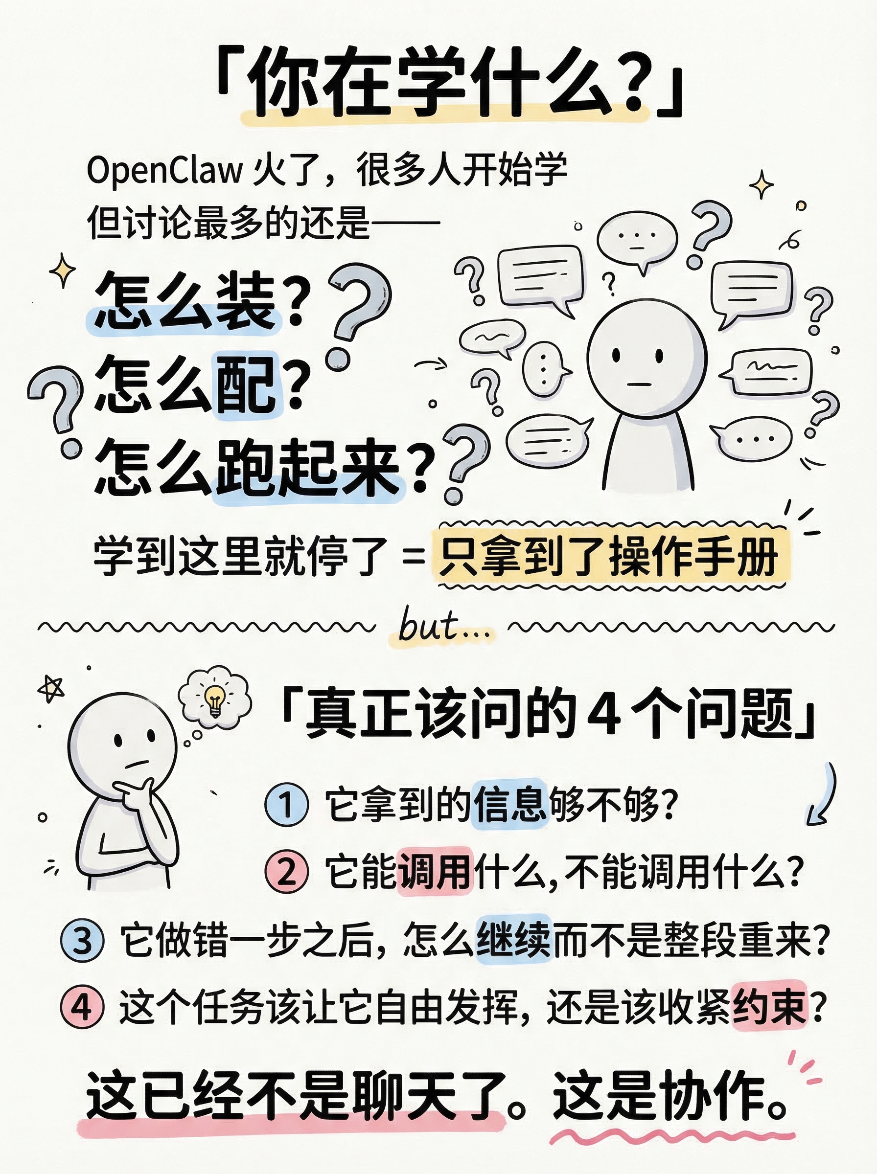
- Title: 「你在学什么?」(top, large bold)
- Pain point block:
- OpenClaw 火了,很多人开始学
- 但讨论最多的还是——
- 怎么装?怎么配?怎么跑起来?
- (these three in larger text, with hand-drawn question marks)
- 学到这里就停了 = 只拿到了操作手册
- Divider line (hand-drawn)
- But actually, the real questions are:
- Title: 「真正该问的4个问题」
- ❶ 它拿到的信息够不够?
- ❷ 它能调用什么,不能调用什么?
- ❸ 它做错一步之后,怎么继续而不是整段重来?
- ❹ 这个任务该让它自由发挥,还是该收紧约束?
- Bottom note: 这已经不是聊天了。这是协作。(with hand-drawn underline emphasis)
**Visual Concept**:
Top half: A stick figure surrounded by floating text bubbles saying "怎么装?" "怎么配?" "怎么跑?" — feel busy and surface-level. The stick figure has a simple, neutral expression — just a round head with two dots for eyes and a small straight line for mouth. Keep the face minimal and clean, no exaggerated expressions.
A hand-drawn wavy divider line with a small "but..." text.
Bottom half: The same stick figure now pausing, chin on hand, thinking deeper. Four numbered items in a clean list with circled numbers. Each question has a key word highlighted (信息、调用、继续、约束).
Bottom: A bold closing statement with underline: "这已经不是聊天了。这是协作。"
Notion style: White background, black ink, pastel accents for highlights on key words.
---
Please use nano banana pro to generate the infographic based on the specifications above.
#3
content use vs master
03-content-use-vs-master.png
Create a Xiaohongshu (Little Red Book) style infographic following these guidelines:
## Image Specifications
- **Type**: Infographic, **Orientation**: Portrait (vertical), **Aspect Ratio**: 3:4, **Style**: Hand-drawn illustration
## Core Principles
- Hand-drawn quality throughout - NO realistic or photographic elements
- ALL text MUST be hand-drawn style, DO NOT use computer-generated fonts
- Language: Chinese (简体中文)
- Do NOT include any page numbers or "Page X of Y" text
## Style: Notion
**Color Palette**: Primary: Black (#1A1A1A), dark gray (#4A4A4A). Background: Pure white (#FFFFFF), off-white (#FAFAFA). Accents: Pastel blue (#A8D4F0), pastel yellow (#F9E79F), pastel pink (#FADBD8).
**Visual**: Clean line doodles, hand-drawn wobble effect, geometric shapes, single-weight ink lines, organized compositions.
---
## Layout: Comparison (left vs right split)
## Content
**Position**: Content
**Core Message**: "使用"AI vs "驾驭"AI — 两种完全不同的关系
**Text Content**:
- Title: 「使用 AI vs 驾驭 AI」(top center, large bold)
- Left column (labeled 使用 AI):
- 问一个问题 → 拿一个答案
- 改一版 → 再追问一轮
- AI = 高级搜索框
- 你不问,它不动
- 关心:提示词怎么写、答得好不好、能不能一次吐对
- Right column (labeled 驾驭 AI):
- 给目标、工具、上下文、权限边界
- AI 自己拆任务、调用工具、持续推进
- AI = 一个不稳定但能干活的数字同事
- 你不在,它也在往前推
- 关心:目标够不够清楚、上下文对不对、工具链配没配对、权限松紧、卡住怎么接管
- Bottom: 前者像搜索框,后者像带团队
**Visual Concept**:
左右对比分割,Notion 极简线条风
左侧用灰色线条和淡色调——一个小人对着屏幕打字,循环箭头
右侧用黑色线条和淡蓝色块——一个小人在白板前部署,旁边 AI 机器人自主工作
中间手绘虚线分割
底部一句总结,手写字体加下划线
---
Please generate the infographic based on the specifications above.
#4
content focus shift
04-content-focus-shift.png
#5
content three stages
05-content-three-stages.png
Create a Xiaohongshu (Little Red Book) style infographic following these guidelines:
## Image Specifications
- **Type**: Infographic, **Orientation**: Portrait (vertical), **Aspect Ratio**: 3:4, **Style**: Hand-drawn illustration
## Core Principles
- Hand-drawn quality throughout - NO realistic or photographic elements
- ALL text MUST be hand-drawn style, DO NOT use computer-generated fonts
- Language: Chinese (简体中文)
- Do NOT include any page numbers, "Page X of Y", or "Content (Page X of Y)" text anywhere on the image
## Style: Notion
**Color Palette**: Primary: Black (#1A1A1A), dark gray (#4A4A4A). Background: Pure white (#FFFFFF), off-white (#FAFAFA). Accents: Pastel blue (#A8D4F0), pastel yellow (#F9E79F), pastel pink (#FADBD8).
**Visual**: Clean line doodles, hand-drawn wobble effect, geometric shapes, single-weight ink lines, organized compositions.
---
## Layout: Flow (connected stages, top to bottom)
## Content
**Position**: Content
**Core Message**: 上手 Agent 的三个阶段
**Text Content**:
- Title: 「驾驭 AI 的三个阶段」(top, large bold)
- Stage 1: 😮 新鲜
- "它真的开始自己做事了!"
- 不只回你"建议如下"
- Stage 2: 😰 失控
- 任务一长就乱,步骤一多就偏
- 你开始着急但不知道怎么插手
- Stage 3: 🧐 介入
- 你开始看过程——
- 是上下文没给够?工具没配对?目标太大太空?
- 开始有意识地调整和干预
- Bottom: 到了第3步 = 你已经在「驾驭」了 ✨
**Visual Concept**:
三阶段垂直流程图,每阶段一个圆角框,手绘弯曲箭头连接
阶段1(顶部):惊喜的小人 + AI 机器人自主工作,浅色边框
阶段2(中部):慌张的小人 + AI 机器人走偏,薄边框
阶段3(底部):冷静思考的小人在调整设置面板,加粗边框 + 淡蓝色背景高亮——这是重点阶段
底部手写体金句,配星星装饰
---
Please generate the infographic based on the specifications above.
#6
content three keys
06-content-three-keys.png
Create a Xiaohongshu (Little Red Book) style infographic following these guidelines:
## Image Specifications
- **Type**: Infographic
- **Orientation**: Portrait (vertical)
- **Aspect Ratio**: 3:4
- **Style**: Hand-drawn illustration
## Core Principles
- Hand-drawn quality throughout - NO realistic or photographic elements
- Clear numbered list with explanations
- Compact but readable
- Maintain clear visual hierarchy
## Text Style (CRITICAL)
- **ALL text MUST be hand-drawn style**
- Main titles should be prominent and eye-catching
- Key text should be bold and enlarged
- Use highlighter effects to emphasize keywords
- **DO NOT use realistic or computer-generated fonts**
## Language
- All text in Chinese (简体中文)
- Match punctuation style: "",。!
---
## Style: Notion
**Color Palette**:
- Primary: Black (#1A1A1A), dark gray (#4A4A4A)
- Background: Pure white (#FFFFFF), off-white (#FAFAFA)
- Accents: Pastel blue (#A8D4F0), pastel yellow (#F9E79F), pastel pink (#FADBD8)
**Visual Elements**:
- Simple line doodles, hand-drawn wobble effect
- Geometric shapes, stick figures
- Single-weight ink lines
- Clean, organized compositions
**Typography**:
- Clean hand-drawn lettering
- Simple sans-serif labels
- Minimal decoration on text
---
## Layout: List
**Information Density**: Medium-High (3 main items with sub-explanations)
**Structure**: Vertical enumeration with clear numbering
---
## Content
**Position**: Content (Page 5 of 8)
**Core Message**: 驾驭 AI,核心就三件事
**Text Content**:
- Title: 「驾驭,核心就3件事」(top, large bold)
- Subtitle: 不需要精通所有功能 (gray, smaller)
- 1️⃣ 知道它大概能做什么、不能做什么
- → 了解能力边界,不过度期待也不低估
- 2️⃣ 知道怎么给它一个能工作的环境
- → 目标明确 + 上下文充足 + 工具链到位
- 3️⃣ 知道要观察行为,而不只盯着结果
- → 看过程,找卡点,及时接管
- Bottom emphasis: 比"背会所有菜单"重要得多 💡
**Visual Concept**:
Vertical list layout with three large hand-drawn numbers (1, 2, 3) prominently displayed.
Each number is oversized (like a hand-drawn circled number) on the left side.
Next to each number: The main point in bold black, followed by a sub-explanation in gray with a hand-drawn arrow (→) prefix.
Small icon next to each item:
- Item 1: A magnifying glass doodle (representing understanding boundaries)
- Item 2: A toolbox/wrench doodle (representing setting up the environment)
- Item 3: An eye doodle (representing observation)
Bottom: A dashed-line box with the emphasis text "比'背会所有菜单'重要得多 💡" with a hand-drawn lightbulb.
Notion style: White background, large bold numbers in black, sub-text in gray, clean lines. The numbers should be the most visually striking element on the page.
---
Please use nano banana pro to generate the infographic based on the specifications above.
#7
content migration skills
07-content-migration-skills.png
Create a Xiaohongshu (Little Red Book) style infographic following these guidelines:
## Image Specifications
- **Type**: Infographic
- **Orientation**: Portrait (vertical)
- **Aspect Ratio**: 3:4
- **Style**: Hand-drawn illustration
## Core Principles
- Hand-drawn quality throughout - NO realistic or photographic elements
- Information dense — this is a "skill checklist" that readers will want to save
- Clear numbered list with explanations
- Maintain clear visual hierarchy
## Text Style (CRITICAL)
- **ALL text MUST be hand-drawn style**
- Main titles should be prominent and eye-catching
- Key text should be bold and enlarged
- Use highlighter effects to emphasize keywords
- **DO NOT use realistic or computer-generated fonts**
## Language
- All text in Chinese (简体中文)
- Match punctuation style: "",。!
---
## Style: Notion
**Color Palette**:
- Primary: Black (#1A1A1A), dark gray (#4A4A4A)
- Background: Pure white (#FFFFFF), off-white (#FAFAFA)
- Accents: Pastel blue (#A8D4F0), pastel yellow (#F9E79F), pastel pink (#FADBD8)
**Visual Elements**:
- Simple line doodles, hand-drawn wobble effect
- Geometric shapes, stick figures
- Single-weight ink lines
- Clean, organized compositions
**Typography**:
- Clean hand-drawn lettering
- Simple sans-serif labels
- Minimal decoration on text
---
## Layout: List
**Information Density**: High (5 items + key insight)
**Structure**: Vertical list with clear numbering and explanations
---
## Content
**Position**: Content (Page 7 of 10)
**Core Message**: 这些能力换任何工具都能迁移
**Text Content**:
- Title: 「这5个能力,换工具也带得走」(top, large bold)
- Key insight above the list:
- Agent 这波最重要的变化,不是"AI 更聪明了"
- 而是普通人第一次开始接触「组织 AI 干活」
- (this insight in a pastel blue rounded box)
- The 5 transferable skills:
- ① 怎么定义一个可执行的目标
- ② 怎么给 AI 足够但不过量的上下文
- ③ 怎么设计工具和权限
- ④ 怎么观察它到底卡在哪一步
- ⑤ 怎么把人类接管点放在真正关键的位置
- Bottom emphasis: 你学到的不是某个界面,而是「人和 AI 怎么协作」(with hand-drawn highlight)
**Visual Concept**:
Top: Title in large bold hand-drawn text.
Below title: A rounded-corner box with pastel blue background containing the key insight about "Agent's most important change" — two lines, the second line ("组织 AI 干活") in bold.
Main body: Five numbered items in a clean vertical list. Each number is a hand-drawn circled number (①②③④⑤) on the left. Each item has the key concept highlighted:
- "可执行的目标" - pastel yellow highlight
- "足够但不过量" - pastel pink highlight
- "工具和权限" - pastel blue highlight
- "卡在哪一步" - pastel yellow highlight
- "接管点" - pastel pink highlight
Bottom: A bold closing line with hand-drawn underline and a small arrow icon.
Small decoration: A hand-drawn "transfer/migrate" icon (like a suitcase or arrow between two boxes) in the corner.
Notion style: White background, black ink lines, pastel accents for highlights. Like a valuable skill card worth bookmarking.
---
Please use nano banana pro to generate the infographic based on the specifications above.
#8
content framework
08-content-framework.png
Create a Xiaohongshu (Little Red Book) style infographic following these guidelines:
## Image Specifications
- **Type**: Infographic
- **Orientation**: Portrait (vertical)
- **Aspect Ratio**: 3:4
- **Style**: Hand-drawn illustration
## Core Principles
- Hand-drawn quality throughout - NO realistic or photographic elements
- Information dense - this is a "worth saving" knowledge card
- Clear visual hierarchy with bullet points
- Compact but readable spacing
## Text Style (CRITICAL)
- **ALL text MUST be hand-drawn style**
- Main titles should be prominent and eye-catching
- Key text should be bold and enlarged
- Use highlighter effects to emphasize keywords
- **DO NOT use realistic or computer-generated fonts**
## Language
- All text in Chinese (简体中文)
- Match punctuation style: "",。!
---
## Style: Notion
**Color Palette**:
- Primary: Black (#1A1A1A), dark gray (#4A4A4A)
- Background: Pure white (#FFFFFF), off-white (#FAFAFA)
- Accents: Pastel blue (#A8D4F0), pastel yellow (#F9E79F), pastel pink (#FADBD8)
**Visual Elements**:
- Simple line doodles, hand-drawn wobble effect
- Geometric shapes, stick figures
- Single-weight ink lines
- Clean, organized compositions
**Typography**:
- Clean hand-drawn lettering
- Simple sans-serif labels
- Minimal decoration on text
---
## Layout: List
**Information Density**: High (5 key questions + summary)
**Structure**: Vertical list with diamond markers, summary box at bottom
---
## Content
**Position**: Content (Page 6 of 8)
**Core Message**: 不会过时的判断框架
**Text Content**:
- Title: 「工具会变,这些判断不会」(top, large bold)
- Framework checklist:
- ✦ 什么任务适合交给 AI 连续推进?
- ✦ 什么任务必须让人卡在关键节点?
- ✦ 什么时候要补上下文?
- ✦ 什么时候该收紧权限?
- ✦ 什么时候应该停下来,重新定义目标?
- Bottom box: 换一个工具还在。换一波产品还在。甚至换一种交互方式,依然还在。
- Tag line: 这套思维 ≠ OpenClaw 操作手册
**Visual Concept**:
A "memo card" / "notebook page" style layout.
Title at top in bold hand-drawn text.
Five items listed vertically, each with a hand-drawn diamond (✦) marker.
Key words in each line have hand-drawn highlighter effects:
- "连续推进" - pastel blue highlight
- "关键节点" - pastel yellow highlight
- "上下文" - pastel pink highlight
- "权限" - pastel blue highlight
- "目标" - pastel yellow highlight
Bottom: A rounded-corner box with pastel blue background containing the summary quote in two lines.
Below the box: A small tag line "这套思维 ≠ OpenClaw 操作手册" in gray handwritten text.
Small decoration: A hand-drawn open notebook icon in the bottom-right area.
Overall feel: Like a page from a valuable notebook that's worth screenshotting and saving.
---
Please use nano banana pro to generate the infographic based on the specifications above.
#9
content watershed
09-content-watershed.png
#10
ending
10-ending.png